Challenge
The Cancer Atlas holds a wealth of information that requires guided entry points to draw in diverse audiences. Building on our previous collaborations, The American Cancer Society (ACS) enlisted Language Dept. to design the third print edition and reimagine the companion website by visually translating over 100 data sets to tell the story. Throughout our discovery and stakeholder interviews, a strong message emerged: access—to cancer research, health education, research funding, vaccinations, proper training, policy makers and advocates—is a pathway to solving cancer.


Strategy
Design for reach.
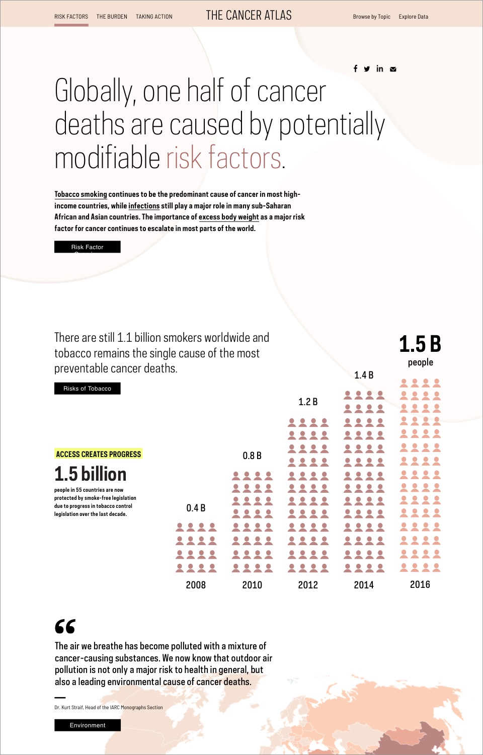
Persuasiveness of data is what makes these companion pieces such valuable tools, whether hand-delivered to a Minister of Health, shared in a tweet to put pressure on policy makers, or embedded in a presentation to fellow scientists and NGOs. The interactive and print experiences literally give access to data to spur progress in cancer research and advocacy.

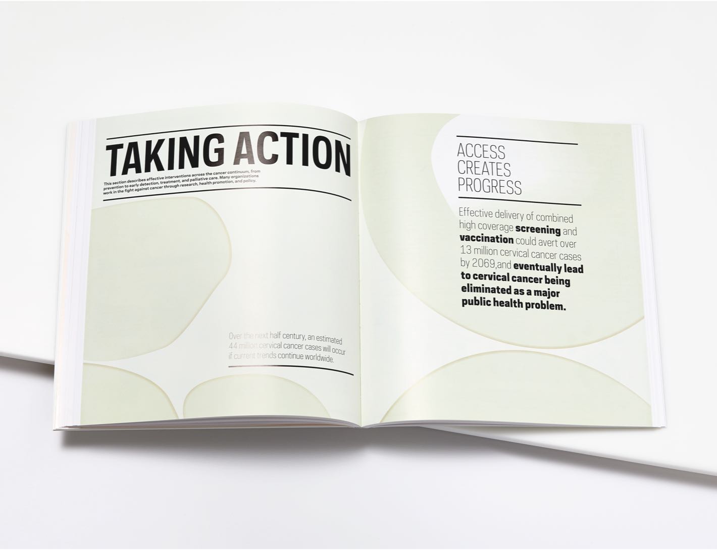
Beyond design, Language Dept. has helped us craft the impression and impact of the project. Early on, they brought the theme “access creates progress” out of our ideas to differentiate this new Cancer Atlas from previous editions. It was incredibly insightful and really helped to shape the book and site moving forward. The theme has also become a focal point of the Atlas and its promotion.
Lindsey Torre, MSPH,
Scientist, Surveillance Research, American Cancer Society
Solution
Surface the stories in the data.
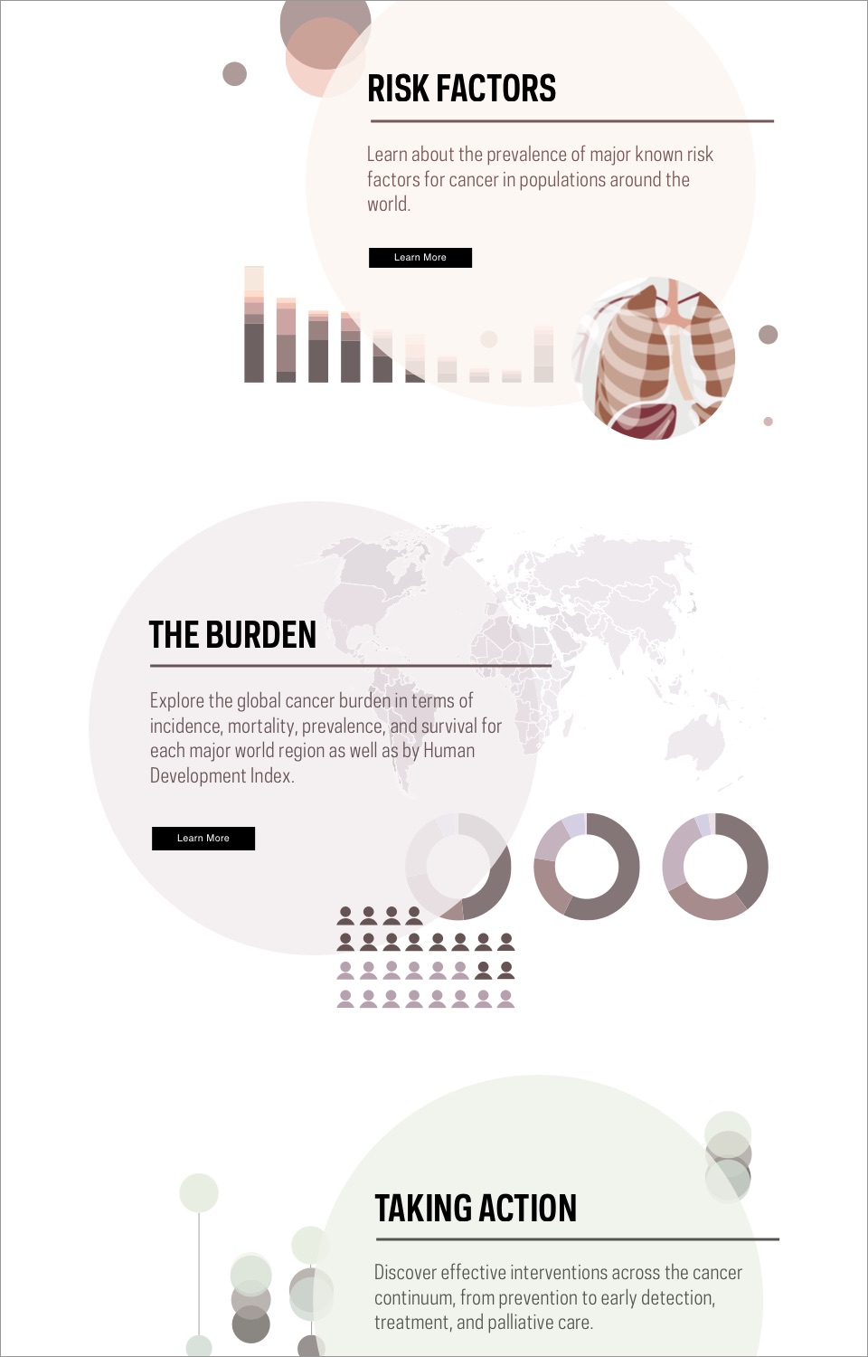
To guide visitors into the data-rich site, we reimagined navigation and used animation and motion as storytelling devices. The homepage narrative map and parallax-driven landing pages gave visitors entry points and takeaways in order to choose topics to dive further into. These experiences use data visualization to bring key takeaways into focus, to identify patterns, and to allow users to visually track data over time.
Map the needs for print and web.
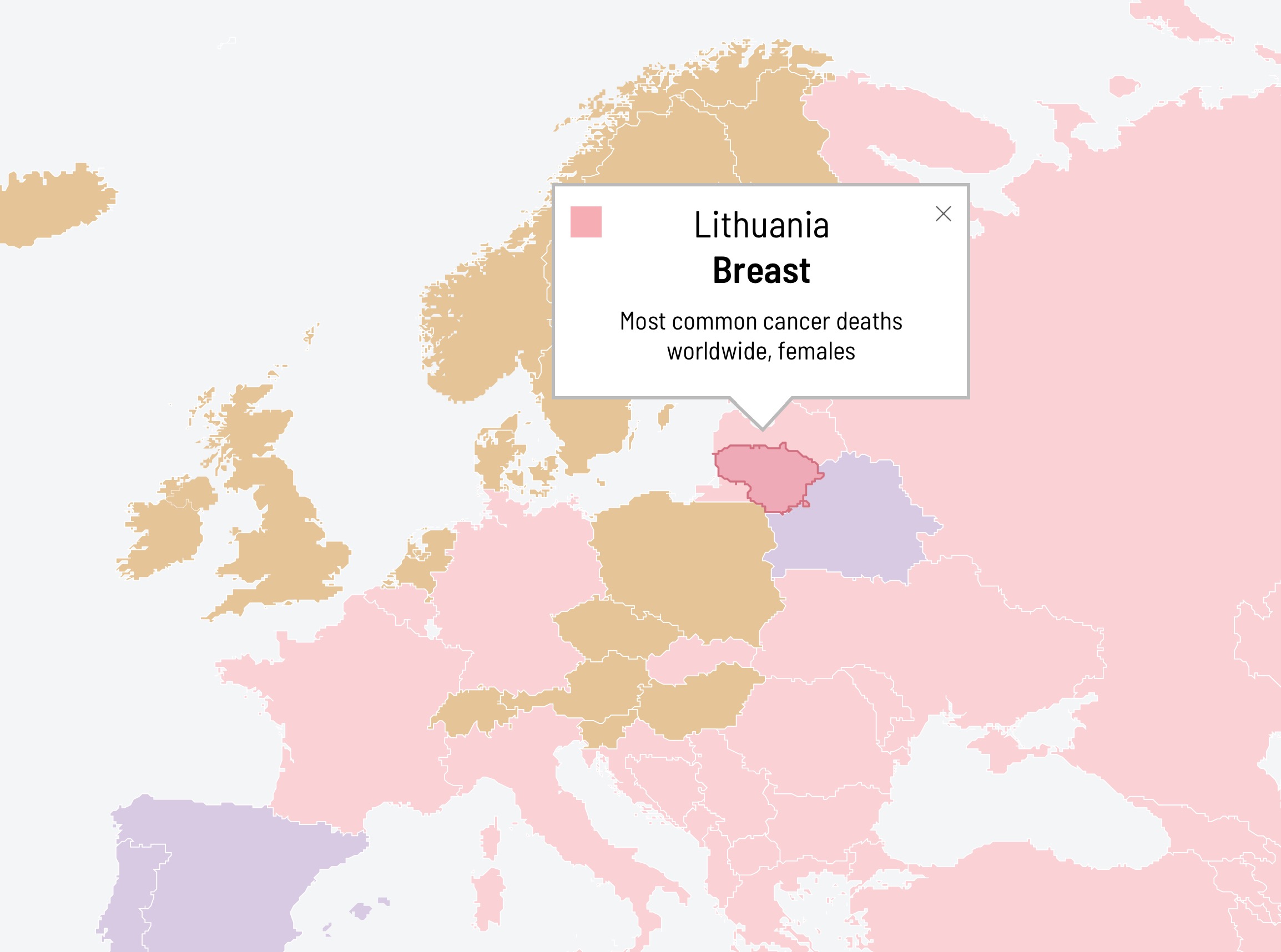
We explored new charting tools to meet the parallel needs of the book and site to create interactive, responsive figures and choropleth maps that could also be reproduced beautifully in print. Rather than render the information directly from the book, the website offered an opportunity to work more as interpreter and less as translator. This flexibility created unique ways to experience and use the information, from desktop to mobile to in-hand book.
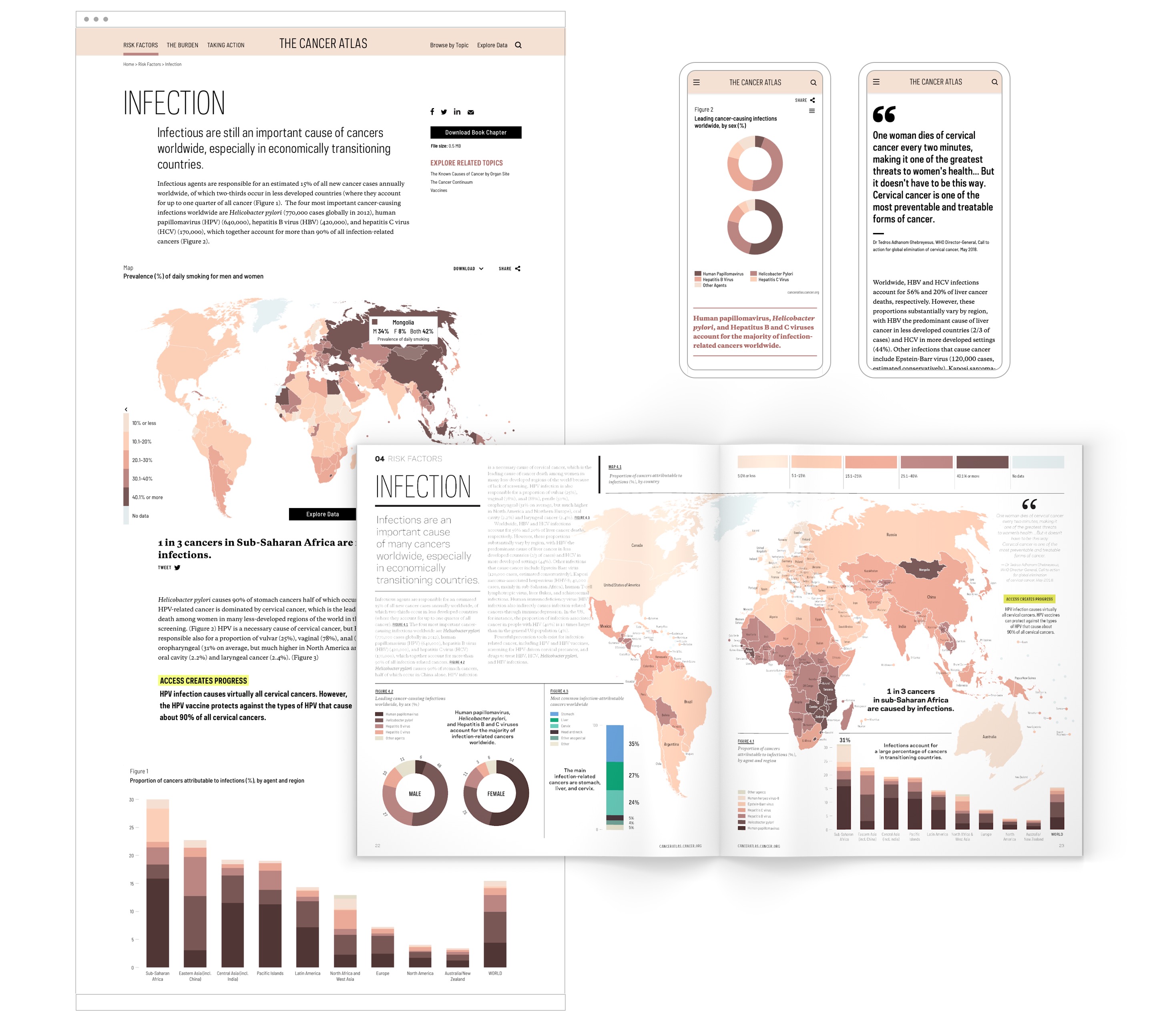
Reveal intertwined narratives through color systems.
Our job was to preserve the scientific truth of the research, while making the narrative compelling to a broad audience including cancer control advocates, government and public health agencies, and policymakers as well as patients, survivors, and the general public. We used color as a wayfinding tool to help readers easily locate relevant topics, while revealing the human story. Two parallel color systems visually key cancer types and organize chapters by color-coded sections.


Results
Project reach
Scope
- Stakeholder Interviews & Workshops
- Audience & Landscape Research
- Insights & Positioning
- Storytelling Strategy
- User Experience
- Data Visualization
- Book Design
- Web & Mobile Design
- Motion Graphics & Animation
Team
- Sarah Asip, System Design & Research
- Jenn Cash, Principal, UX Strategy & Creative Direction
- Jesse Lankford, UX Research
- Jenna Park, Lead, User Experience
- Rachel Shim, UI and Data Visualization
- Niquita Taliaferro, UX Research and IA
- Jada Vogt, Art Direction & Visual Design
- Frank Wild, Studio Assistant
Collaborators
- ACS Research and Epidemiologist Editors
- Atlantic 57, Web development